
These days nearly 70 percent of searches now from mobile and other devices, Using responsive web design means that the website should automatically adapt to screen resolutions, display size as well as browser and operating system capabilities. With the upgradation of type of interaction, the mode of interaction has also changed. Web pages are being read on various devices like mobiles, iPads, tablets, etc.
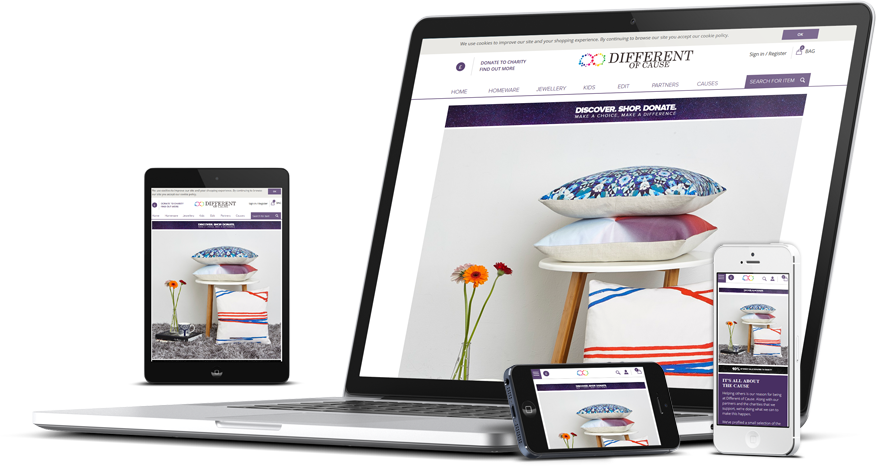
SPRIGHT TECHNOLOGIES (P) Ltd. develops your websites using latest bootstrap technology to make compatible in all devices like Smartphone, iphones, tablets, laptops & of course computers. Websites adjust its structure in different screen resolutions automatically and thus are very user-friendly. Apart from it, these sites are well tested in different browsers such as Google chrome, Mozilla, internet explorer, safari etc.
We deliver better user experience: By using Spright Technologies Responsive web design services you can give a better user experience to your visitors. If your Website is not responsive, you may lose many potential visitors.
Luckily, we will help you in improving your responsive web design and search engine ranking. It will also save your time and cost in maintaining and developing a mobile version of a website